Logo revision
- Jul 17, 2016
- 1 min read

I made this logo by using flower image and my name initial. The flower color adjusted the logo gives lively and sophisticated feel and shows my personal brand. By using only initial instead of my full name, the logo became more simple and clean. Also, I put two lines at the top and bottom of my name initial. They made my logo get simple but sophisticated look. Each line means people or community, and I want to communicate between them to be connected with each other.
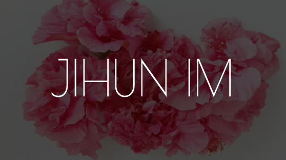
This is second version of my logo. I put black color using opacity on the flower image to be easy to see and read my full name.

Comments