Analysis: Event Inspiration
- Apr 13, 2017
- 3 min read
For this activity, I analyzed three event sites. It provides valuable insight into how I can approach my own User Interface and User Experience design.


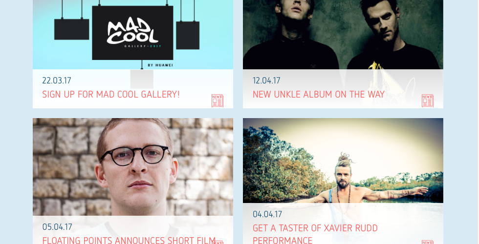


First, I chose a website for Mad Cool festival. The main color that I can see is pastel tone pink and blue. Their logo is made by both white and black color for their website and poster. This website has five main categories of home, tickets, line up, news, and previous editions. In tickets page, there are 5 types of ticket that they provide. If the ticket with gray color shows sold out, and the ticket you can buy has pink and purple color for buttons. If you can click buy tickets, you can go to the another site to buy them. They use clear and high-quality photos to show their line up and if you click, you can see more detailed information about them. Their news page looks similar with line-up page, and they provide previous editions. If I click the logo, I can back to the home page. For the mobile site, it works well and has same information with the web site. Overall, a user interface for this website is intuitive that makes it easy for me to find what I want and it had consistent brand aesthetic in each page. Also, I think this website and web applications are accessible to and usable by everyone.
Secondly, I chose a website for outlook festival. Its home page is very simple with image slider with beautiful and high-quality images and four important categories of tickets, opening concert, travel, accommodation. The main colors are orange and yellow. They have five main categories of Book now, Programme, Info, Partners, and Get Involved, and they have submenu under the main categories. In tickets page, you can know easily how you can book with orange buttons and FAQ. In all pages, they put photos on the left and put texts on the right. In the lineup page, they use grayscale photos for singers and emphasize their name with orange colors. They also have volunteer pages. This website shows their brand consistency on each page with orange colors, layouts, and photos representing similar atmosphere. It has a very intuitive design. Accessibility is also great. I think the accessibility of this website is better than the website for Mad Cool festival. For the mobile site, it also works well by providing same information clearly.
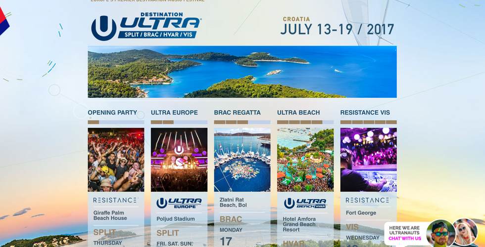
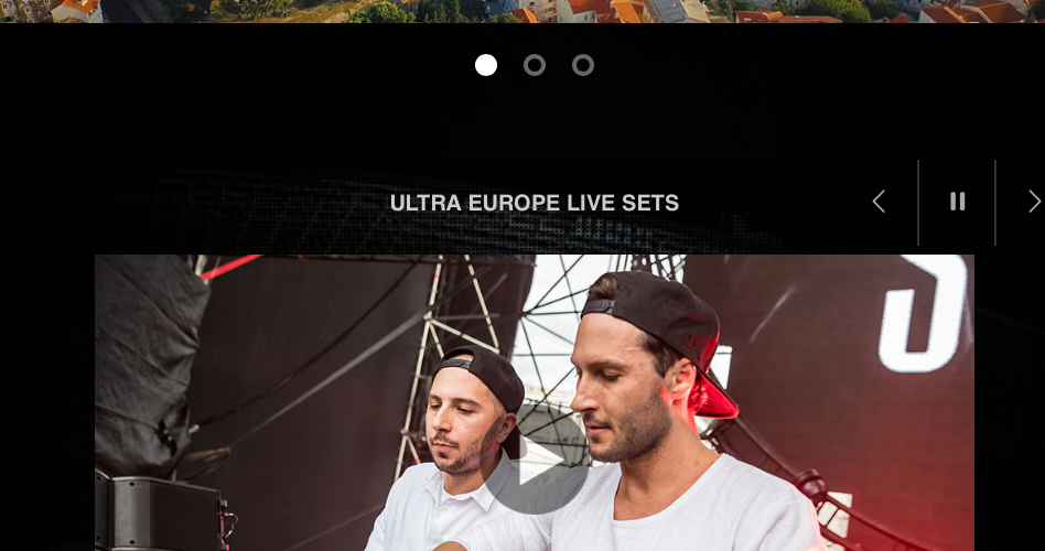
Lastly, I chose a website for Ultra Europe. This website’s main color is black and blue. Their background seems like screen with the festival image. They have six main categories of Tickets, Destination Ultra, Travel, Media, More, and Worldwide. In Tickets page, I can see subcategories on the left of the page. They emphasize their tickets with fluorescent light blue color. In the Destination Ultra page, you can click one of the five categories you want. If you click opening party, you can see information, buy tickets button, and very high-quality photos. In the media page, they also have screen-like background with festival photos. I think this site is intuitive but it is more complex than other sites for outlook festival and Mad cool festival. This website for ULTRA Europe has so many contents that make feel confuse. However, they show brand consistency on entire pages. It looks like worldwide. For accessibility, it is worse than the other sites because their typefaces are too small. For mobile site, it works well and looks clear with providing the same information.

Comments